Even after the criticisms put
forth in my last blog post, I was still chomping at the bit to get my hands on the tech build of Windows 10,
and today was the day.
 As a
precursor, I should mention that I'm currently using a Microsoft Surface Pro 3 at work. I initially wasn't sure I'd
be able to run the tech preview on the Surface, but suffice it to say it runs pretty well. Also, I don't believe any
of the issues I discuss below are due to the hardware, but more to the fact that Windows 10 is a work in progress.
Most of the little things will probably get worked out at some point. Regardless, I've spent most of the workday
using it, so here are some thoughts...
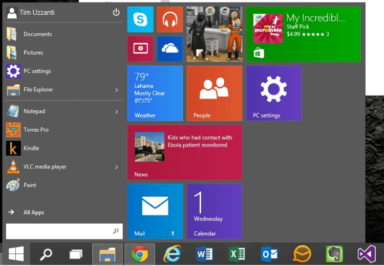
Prior to running Windows 10, I preferred having the icons that were on my taskbar to be desktop related and left all the Windows UI applications on the start screen. Basically, I had two different configurations and, and ways to use, the Surface Pro 3, which wasn't what Microsoft was going for. However, it feels natural to click Windows UI applications on the taskbar alongside the more traditional desktop applications. They coexist seamlessly.
No longer will there be a need for two different applications that serve the same purpose because one works better for desktop while the other works better for the tablet. For example, I had IM+ as a Jabber client connected to our SmarterMail server when in tablet mode. But when in desktop mode, I would use Pidgin. Now, IM+ works in both environments. What does this mean for the Microsoft Store? It's going to EXPLODE because the audience is going to be so much larger! In addition, Windows is going to be much more secure. Instead of finding .EXE's or .ZIP files to download, users are going to look first in the store. It's amazing the changes that can be made and should have been done in the first place that would have put Microsoft in such a better position.
There are some bugs, however. There is some interface and compatibility stuff that is expected from a working build. For example, Windows Defender getting repeatedly stuck and using a significant percentage of CPU, which prevented some Windows UI applications from running until Defender was disabled. However, so far nothing has prevented me from getting work done.
 I REALLY, REALLY, REALLY hope that Microsoft finds a way to seamlessly
integrate the Start Screen and the Start Menu layouts. It's a real pain to have to manage the look and feel of both.
I want them to be in sync. Now that Microsoft made it possible to use all the same Windows UI applications in the
Desktop, they should encourage us to use them by utilizing the Start Screen's layout. This is an absolute
must! Right now it just feels broken and disconnected.
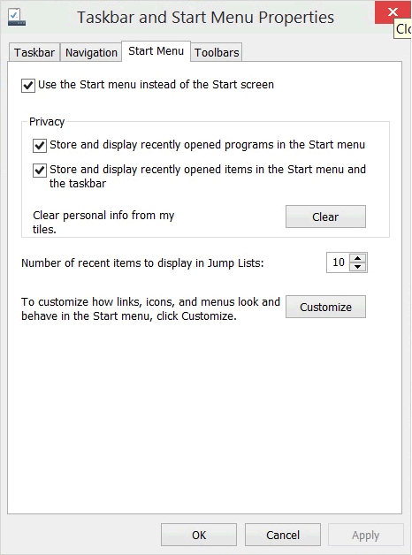
A quick note to users of the Surface Pro 3 or a HP Yoga, or other Windows devices that double as a tablet and a desktop: be aware with this first preview that you will need to manually change the settings to show the Start Screen when running as a tablet. To do this, right mouse click on the task bar, choose properties, go to the Start Menu tab and un-select "Use the Start menu instead of the Start Screen."
The Microsoft Store is going to explode, and in a good way! Now that Windows UI applications run a regular application on the desktop, users are going to go to the store for apps. No longer will users search the web and download EXE and ZIP files. What are the benefits of that? Fewer and fewer machines infected with malware and viruses. Windows will be more secure! It's amazing the changes that can be made and should have been done in the first place that would have put Microsoft in such a better position.
Of course, with every new change comes additions requests from users. Microsoft had better get their network and support teams ready for a deluge! For example, now that I can utilize the native Mail application provided with Windows I need to be able to simply drop files and attach them to new messages. I was also hoping to see some scaling options in the tech preview. One of the drawbacks of having the Surface Pro 3 connected to nice 27-inch monitors is that using the 100% DPI option in Windows makes everything incredibly small on the Surface but look normal on the monitors. Oh how software development never ends! (And how nice to be able to be on the giving end of suggestions rather than the receiving end of suggestions).
I must also say that the virtual desktops are so long overdue! It's such a nice feature in OS X and it feels really good on Windows. Major thanks for this!
In the end, Windows 10 is on the right path. People will feel more comfortable using it as a desktop, which will go a long way to gaining traction in the consumer market. If they implement the "detection" of a keyboard and/or mouse and automatically switch from tablet view to desktop view, they could nail it.Of course, I still have to mention this: What they shouldn't have done is delay the release. As I mentioned in my previous post, Windows 10 should be out by the holidays so Microsoft could capitalize on the $400 million spent with the NFL to market the Surface. If I say it more and more often, maybe it will come true.
